Introduction To Graphs Introduction
The purpose of the graph is to show numerical facts in visual form for their better and quicker understanding. It is especially very useful when there is a trend or comparison to be shown.
A Line Graph
It is a graph which displays data that changes continuously over periods.
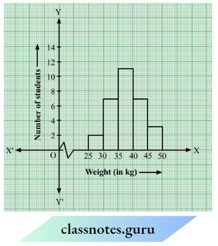
Question What is the information that you gather from the given histogram? Try to list them out.
Solution:
This histogram illustrates the distribution of weights (in kg) of 40 persons in a locality. The information that we gather from this histogram is as follows :
A maximum number of persons in the locality have their weights (in kg) in the interval 50-55.
The minimum number of persons in the locality have their weights (in kg) in the interval 40- 45
NCERT Solutions for Class 8 Maths Chapter 13 Introduction to Graphs
Read and Learn More NCERT Solutions For Class 8 Maths
Introduction To Graphs Exercise 13.1
Question 1. The following graph shows a patient’s temperature in a hospital, recorded every hour.
- What was the patient’s temperature at 1 p.m.?
- When was the patient’s temperature 38.5°C?
- The patient’s temperature was the same two times during the period given. What were these two times?
- What was the temperature at 1.30 p.m.? How did you arrive at your answer?
- During which period did the patient’s temperature show an upward trend?
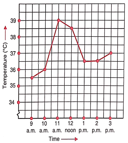
Solution:
The patient’s temperature at 1 p.m. was 36.5°C.
The patient’s temperature was 38.5°C at 12 noon
The two times when the patient’s temperature was the same were 1 p.m. and 2 p.m.
The temperature at 1.30 p.m. was 36.5°C.
From the graph, we see that the temperature was constant from 1 p.m. to 2 p.m. Since 1.30 p.m. comes in between 1 p.m. and 2 p.m., therefore we arrived at our answer.
The patient’s temperature showed an upward trend during the periods 9 a.m. to 10 a.m., 10 a.m. to 11 a.m. and 2 p.m. to 3 p.m.
Question 2. The following line graph shows the yearly sales figures for a manufacturing company.
- What were the sales in
- 2002
- 2006?
- What were the sales in
- 2003
- 2005?
- Compute the difference between the y sales in 2002and 2006.
- In which year was the greatest difference between the sales compared to the previous year?
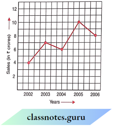
Solution:
The sales in
- 2002 were ₹ 4 crores and in
- 2006 were ₹ 8 crores.
The sales in
- 2003 were ₹ 7 crores and in
- 2005 were ₹ 10 crores.
The difference between the sales in 2002 and 2006 = ₹ 8 crores – ₹ 4 crores = ₹ 4 crores
The difference between the sales in 2002 and 2003 =₹ 7 crores – ? 4 crores =₹ 3 crores
The difference between the sales in 2003 and 2004=₹ 7 crores – ₹ 6 crores = ₹ 1 crore
The difference between the sales in 2004 and 2005 =₹ crores – ₹ 6 crores = ₹ 4 crores
The difference between the sales in 2005 and 2006
= ₹ 10 crores – ₹ 8 crores = ₹ 2 crores
Therefore, in the year 2005, the difference between the sales as compared to the previous year was the greatest.
Question 3. For an experiment in Botany, two different plants, plant A and plant B were grown under similar laboratory conditions. Their heights were measured at the end of each week for 3 weeks. The results are shown in the following graph.
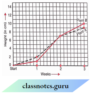
- How high was Plant A after
- 2 weeks
- 3 weeks?
- (b) How high was Plant B after
- 2 weeks
- 3 weeks?
- How much did Plant A grow during the 3rd week?
- How much did Plant B grow from the end of the 2nd week to the end of the 3rd?
- During which week did Plant. A grow most?
- During which week did the Plant grow the least?
- Were the two plants of the same height during any week shown here? Specify.
Solution:
1. The height of Plant A
- after 2 weeks was 7 cm high and
- after 3 weeks it was 9 cm high.
2. The height of Plant B
- after 2 weeks it was 7 cm high and
- after 3 weeks it was 10 cm high.
3. Plant A grew 9 cm – 7 cm = 2 cm during the 3rd week.
4. From the end of the 2nd week to the end of the 3rd week, Plant B grew = 10 cm – 7 cm = 3 cm.
5. The Plant A grew in 1st week = 2 cm – 0 cm = 2 cm
The Plant A grew in 2nd week = 7 cm – 2 cm = 5 cm
The Plant A grew in 3rd week = 9 cm – 7 cm = 2 cm
Therefore, the Plant A grew mostly in Weeks second week
6. The Plant B grew in 1st week = 1 cm – 0 cm = 1cm
The Plant B grew in 2nd week = 7 cm – 1 cm = 6 cm
The Plant B grew in 3rd week = 10 cm – 7 cm = 3 cm
Therefore, Plant B grew the least in the first week.
7. At the end of the week, the two plants shown here were of the same height.
Question 4. The following shows the temperature forecast and the actual temperature for each day of the week:
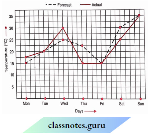
- On which days was the forecast temperature the same as the actual temperature?
- What was the maximum forecast temperature during the week?
- What was the minimum actual temperature during the week?
- On which day did the actual temperature differ the most from the forecast temperature?
Solution:
- The forecast temperature was the same as the actual temperature on Tuesday, Friday and Sunday. This is indicated by the points where the two graphs intersect.
- The maximum forecast temperature during the week was 35°C.
- The minimum actual temperature during the week was 15°C.
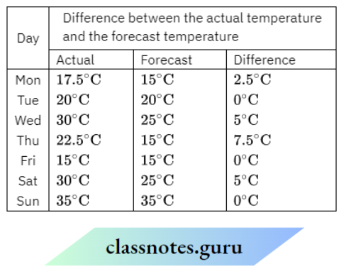
Since the maximum temperature difference is 7.5°C, therefore, the actual temperature filtered the most from the forecast temperature on Thursday.
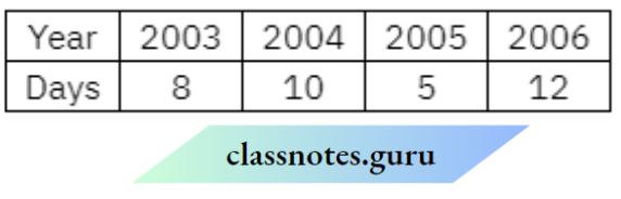
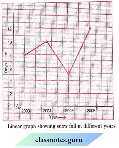
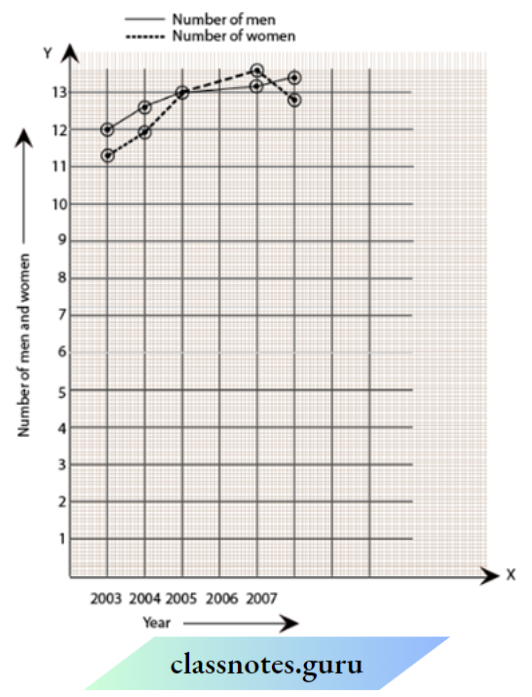
Question 5. Use the tables below to draw linear graphs.
The number of days a hillside city received snow in different years
Population (in thousands) of men and women in a village in different years
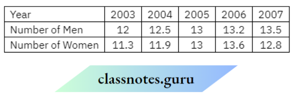
Solution:
Class 8 Maths Chapter 13 Introduction to Graphs Solutions
Question 6. A courier person cycles from a town to a neighbouring suburban area to deliver a parcel to a merchant. His distance from the town at different times is shown in the following graph.
- What is the scale taken for the time xis?
- How much time did the person take 4 for the trave?
- Flow far is the place of the merchant from the tow?
- Did the person slop on his way? Explain.
- During which period did he ride fast?
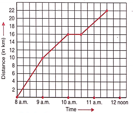
Solution:
1. The scale taken for the time axis (i.e., along the x-axis) is 4 units = 1 hour.
2. Time of the start of the travel = 8 a.m.
Time of the end of the travel = 11.30 a.m.
The time taken by the person for the travel = Difference between 8 a.m. and 11.30 a.m. = 31/2 hours.
3. The place of the merchant from the town is 22 km.
4. Yes. This is indicated by the horizontal part of the graph (10 a.m. -10.30 a.m.)
Distance covered by the person between 8 a.m. and 9 a.m. = (10 – 0) km = 10 km
Distance covered by the person between 9 a.m. and 10 a.m. = (16- 10)=6 km
covered by km the person between 10 a.m. and 10: 30 a.m. = (16 – 16) km = 0 km
Distance covered by the person between 10.30 a.m. and 11.30 a.m. = (22 – 16) km = 6 km
He rides fastest between 8 a.m. and 9 a.m
Question 7. Can there be a time-temperature graph as follows? Justify your answer.
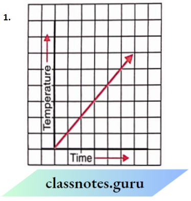
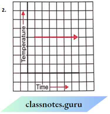
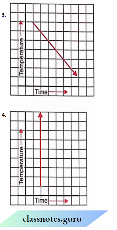
Solution:
- Yes, it can be It is a time-temperature graph because it shows an increase in temperature with an increase in time. Yes, it can be
- it is a time-temperature graph because it shows a decrease in temperature with an increase in time.
- It cannot be a time-temperature graph because it shows infinitely many different temperatures at one particular time which is not possible.
- Yes, it can be It is a time-temperature graph because it shows a fixed temperature at different times (or increasing times)
Some Applications
In our daily life, we observe two quantities that are interrelated i.e., the change in one quantity is accompanied by a change in the other quantity, for example: the more the number of days a labourer works, the more the wages he gets. More the sugar we purchase, more the amount we have to pay.
In the first, case, the number of days is called the independent variable (or control variable) and the wages are called the dependent variable. Similarly, in the second case, the amount of sugar is the independent variable whereas the money paid is the dependent variable.
Thus, an independent variable is a variable which can take values freely i.e., whose value is not dependent on any other variable whereas a dependent variable is a variable where value depends upon the other variable, i.e., independent variable.
The relation between the independent and dependent variables can be shown by a graph.
Question 1. The number of litres of petrol you buy to fill a car’s petrol tank will decide the amount you have to pay. Which is the independent variable here? Think about it
Solution:
The independent variable here is the amount of petrol we buy to fill a car’s petrol tank.
Question 2. In the given example use the graph to find how much petrol can be purchased for 800.
Solution:
Mark the point representing 800 the on y-axis. From this point, draw a line, parallel to the line graph at point, draw a line parallel to OY to ow cut OX at a point This point represents litres on the x-axis Hence, 16 litres of petrol can be purchased for 800
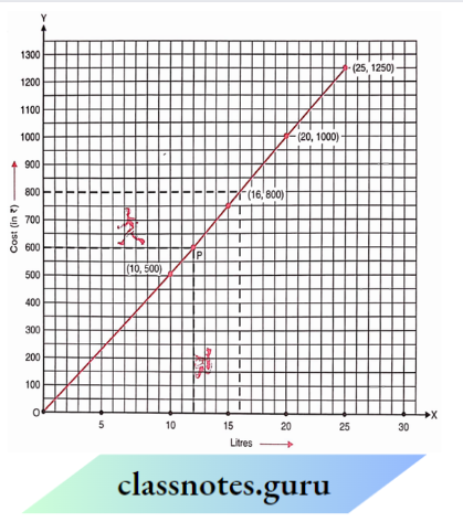
Question Is Example a case of direct variation?
Solution:
It is a case of direct variation as
⇒ \(\frac{100}{10}=\frac{200}{20}=\frac{300}{30}=\frac{500}{50}=\frac{1000}{100}\) = 10 (constant)
Exercise 13.2
Question 1. Draw the graph for the following tables of values, with suitable scales on the axes.
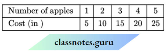
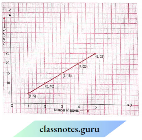
1. Cost of apples
2. Distance travelled by car
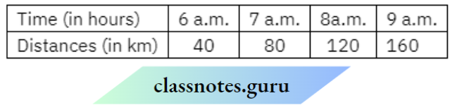
- How much distance did the car cover during the period 7.30 a.m. to 8 a.m.?
- What was the time when the car had covered a distance of 1000 km since its star?
3. Interest on deposits for a year
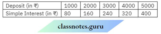
- Does the graph pass through the origin?
- Use the graph to find the interest on 72500 for a year.
- To get an interest of f280 per year, how much money should be deposited?
Solution:
Scale:
On the horizontal axis: 2 units = 1 apple
On the vertical axis: 1 unit = ? 5
Mark the number of apples on the horizontal axis.
Mark cost (in ?)the on vertical axis.
Plot, the points: (1, 5), (2, 10), (3, 15), (4, 20) and (5, 25).
Join the points.
We get a linear graph.
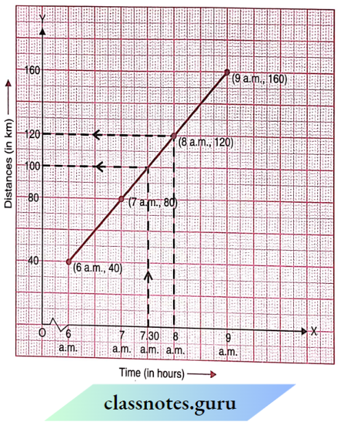
Scale :
On the horizontal axis: 2 units = 1 hour
On the vertical axis: 2 units = 40 km
Mark time (in hours)the on horizontal axis.
Mark distances (in km)the on vertical axis.
Plot the points (6 a.m., 40), (7 a.m., 80), (8 a.m., 120) and (9 a.m. 160).
Join the points.
We get a linear graph.
Distance covered during 7.30 a.m. to 8 a.m. = 120 km – 100 km = 20 km
The time when the car had covered a distance of 100 k Since its start was 7.30 a.m.
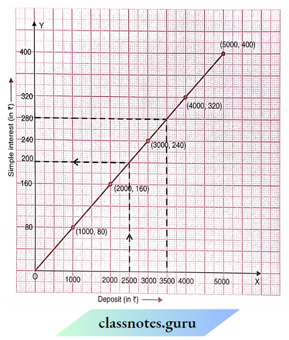
Scale :
On the horizontal axis: 2 units? 1000
On the vertical axis: 2 units 80
Mark deposit (in ?) on the horizontal axis.
Mark simple interest (in ?) on the vertical axis.
Plot the points (1000, 80), (2000, 160), (3000, 240), (4000, 320) and (5000, 400).
Join the points.
We get a linear graph.
Yes, The graph passes through the origin.
Interest o ? 2500 for a year = ? 200
To get an interest of? 280 per year? 3500 should be deposited.
Question 2. Draw a graph for the following:
Is it a linear graph?
Is it a linear graph?
Solution:
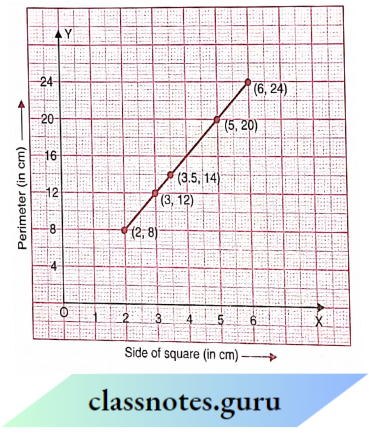
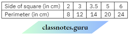
Scale:
On the horizontal axis : 1 unit = 1 cmOn thee vertical axi : 1 unit = 4 cm
Mark the side of the square (in cm) on the horizontal axis
Mark the perimeter (in cm) on vertical
Plot the points (2, 8), (3,12), (3.5, 14), (5, 20) and (6, 24).
Join the points.
Yes, It is a linear graph.
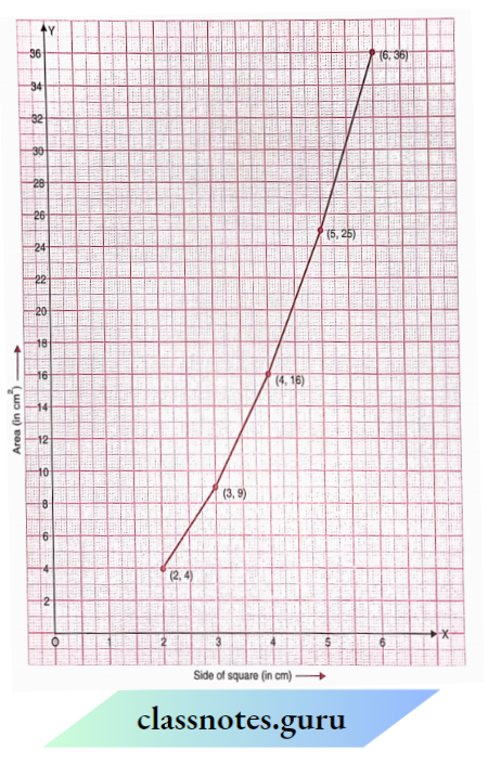
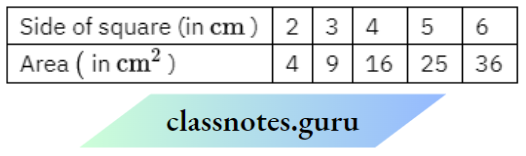
Scale :
On the horizontal axis: 2 units = 2 cm
On the vertical axis: 1 unit = 2 cm
Mark the side of the square (in cm) on the horizontal axis.
Mark the area (in cm2) on the vertical axis.
Plot the points (2, 4), (3, 9), (4, 16), (5, 25) and (6, 36).
Join the points.
The graph we get is not linear.
Introduction to Graphs Class 8 NCERT Solutions
Multiple-Choice Questions and Solutions
Observe the following bar graph and answer the related questions:
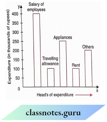
Question 1. On which head, is the expenditure maximum?
- Travelling allowance
- Rent
- Appliances
- Salary of employees.
Solution: 4. Salary of employees.
Question 2. On which head or head, is the expenditure minimum?
- Travelling allowance or rent
- Appliances
- Salary of employees
- Others.
Solution: 1. Travelling allowance or rent
Question 3. On which two heads, is the expenditure the same?
- Salary of employees and others
- Travelling allowance and rent
- Appliances and rent
- Appliances and others
Solution: 2. Travelling allowance and rent
Question 4. What is the difference in expenditure (in thousands of rupees) between the salary of employees and rent?
- 100
- 200
- 300
- 400
Solution: 3. 300
Question 5. What is the sum of the expenditures (in thousands of rupees) on travelling allowance and rent?
- 100
- 200
- 300
- 400
Solution: 2. 200
Observe the following circle graph and answer the related questions:
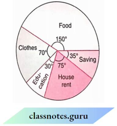
Question 6. On which head is the expenditure maximum?
- Food
- Clothes
- House rent
- Education.
Solution: 1. Food
Question 7. On which head is the expenditure minimum
- Education
- Food
- House rent
- Clothes.
Solution: 1. Education
Question 8. If the budget of the family is ₹ 10800, what is the savings?
- ₹ 1050
- ₹ 950
- ₹ 1000
- ₹ 1200.
Solution: 1. ₹ 1050
Question 9. What is the difference in spending on clothes and education the budget of the family is ₹ 1000.
- ₹ 1200
- ₹ 800
- ₹ 1000
- ₹ 1500.
Solution: 1. ₹ 1200
Question 10. What is the sum of the expenditures on food and education if the budget of the family is ₹ 1080?
- ₹ 5000
- ₹ 5400
- ₹ 8000
- ₹ 6000
Solution: 3. ₹ 8000
Observe the following circle graph and answer the related questions:
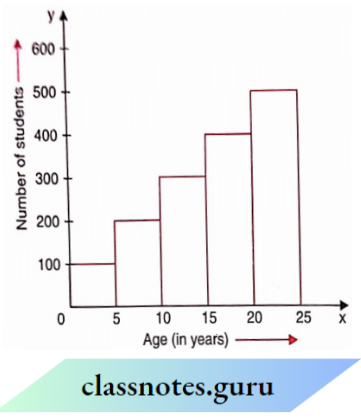
Question 11. In which class intervals, are the maximum number of students?
- 0-5
- 5-10
- 20-25
- 15-20
Solution: 3. 20-25
Question 12. In which class intervals, are the minimum number of students?
- 0-5
- 5-10
- 10-15
- 15-20
Solution: 1. 0-5
Question 13. In which class intervals, is the number of students 200?
- 0-5
- 5-10
- 20-25
- 15-20
Solution: 1. 0-5
NCERT Class 8 Maths Chapter 13 Exercise Solutions
Question 14. The difference in the number of students in class intervals 0-5 and 5- 10 is
- 100
- 200
- 300
- 400
Solution: 1. 100
Question 15. The sum of the number of students in the class intervals 10-15 and 20-25 is
- 800
- 900
- 600
- 400
Solution: 1. 800
Observe the following temperature-timeline graph and answer the related questions:
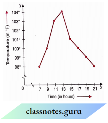
Question 16. At what time is the temperature maximum?
- 13 hours
- 15 hours
- 11 hours
- 19 hours
Solution: 1. 13 hours
Question 17. At what time(s) is the temperature minimum?
- 7 hours and 21 hours
- 9 hours
- 11 hours
- 13 hours.
Solution: 1. 7 hours and 21 hours
Question 18. 103°F temperature is the time
- 11 hours
- 13 hours
- 15 hours
- 21 hours.
Solution: 1. 11 hours
Question 19. What is the difference of temperatures at 7 hours and 21 hours?
- 0°F
- 1°F
- 2°F
- 3°F
Solution: 1. 0°F
Question 20. What is the rise in temperature from 11 hours to 13 hours?
- 1°F
- 2°F
- 3°F
- 4°F
Solution: 1. 1°F
Question 21. What is the fall in temperature from 13 hours to 21 hours?
- 2°F
- 3°F
- 4°F
- 6°F
Solution: 1. 2°F
Class 8 Maths Chapter 13 Question Answer
Question 22. The coordinates of the origin are
- (0,0)
- (1,0)
- (0,1)
- (1,1)
Solution: 1. (0,0)
Question 23. What are the coordinates of a point whose .v-coordinate is 3 andy-coordinate is 4?
- (3,3)
- (3,4)
- (4,3)
- (4,3)
Solution: 2. (3,4)
Question 24. What are the coordinates of a point whose x-coordinate is 1 and y-coordinate is 0?
- (1,0)
- (0,0)
- (0,1)
- (1,1)
Solution: 1. (1,0)
Question 25. What are the coordinates of a point whose v-coordinate is 0 and whose y-coordinate is?
- (0,1)
- (0,0)
- (1,0)
- (1,1).
Solution: 1. (0,1)
Observe the following velocity-lime graph and answer the related questions:
Question 26. At what time is the velocity maximum?
- 7
- 8
- 9
- 10
Solution: 1. 6
Question 27. At what time is the velocity minimum?
- 8
- 9
- 10
- 11
Solution: 4. 11
Question 28. At what times are the velocities equal?
- 8 and 12
- 9 and 11
- 7 and 12
- 11 and 13.
Solution: 1. 8 and 12
Question 29. What is the fall in velocity from 7 to 1 1?
- 80 km/hour
- 90 km/hour
- 100 km/hour
- 20 km/hour.
Solution: 1. 80 km/hour
Question 30. What is the rise in velocity from 11 to 12?
- 10 km/hour
- 20 km/hour
- 30 km/hour
- 60 km/hour.
Solution: 4. 60 km/hour.
Observe the following runs-over graph and answer the related questions:
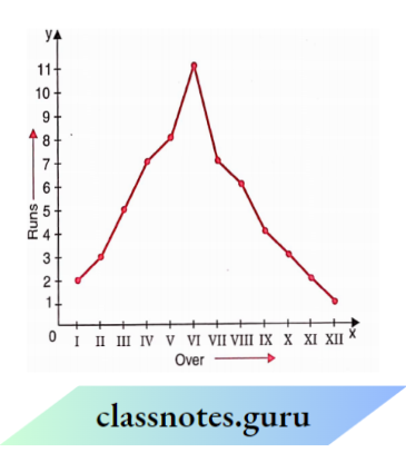
Question 31. In which over is the maximum scoreboard scored?
- 2
- 4
- 5
- 6
Solution: 4. 6
Question 32. In which over are the maximum runs scored?
- 10
- 11
- 12
- 9
Solution: 3. 12
Question 33. What is the difference in runs scored in IV and V overs?
- 1
- 2
- 3
- 4
Solution: 1. 1
Question 34. What is the sum of runs scored in I and XII overs?
- 1
- 2
- 3
- 4
Solution: 1. 1
Question 35. 3 runs are scored in which over?
- 2 and 10
- 1 and 5
- 7 and 8
- 10 and 12
Solution: 3. 7 and 8
Class 8 Maths NCERT Chapter 13 Graph Questions
Read the graph and answer the related questions:

Question 36. In which year was the rate of interest maximum?
- 2005
- 2003
- 2006
- 2002.
Solution: 1. 2005
Question 37. In which year was the rate of interest minimum
- 2006
- 2004
- 2001
- 2005.
Solution: 1. 2006
Question 38. The difference in the maximum and minimum rates of interests
- 2%
- 4%
- 6%
- 8%.
Solution: 4. 8%.
Question 39. The rise in interest from 2004 to 2005 was
- 2%
- 4%
- 6%
- 8%.
Solution: 2. 4%
Question 40. The fall in interest from 2001 to 2002 was
- l%
- 2%
- 3%
- 4%.
Solution: 2. 2%
Read the graph and answer the related questions :
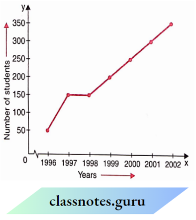
Question 41. How many students appeared in the year 2000?
- 200
- 250
- 300
- 350.
Solution: 2. 250
Question 42. In which year did 50 students appear?
- 1998
- 2001
- 1997
- 1996.
Solution: 4. 1996.
Question 43. In which year did the maximum number of students appear?
- 2002
- 2000
- 2001
- 1999.
Solution: 1. 2002
Question 44. What is the maximum number of students that appeared in any year?
- 350
- 300
- 250
- 300.
Solution: 1. 350
Question 45. In which two years was the number of students appearing the same?
- 1997 and 1998
- 1998 and 1999
- 1999 and 2000
- 2000 and 2001.
Solution: 1. 1997 and 1998
Introduction to Graphs Class 8 Chapter Explanation and Solutions
Read the graph and answer the related questions:
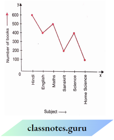
Question 46. The maximum books are of which subject?
- Hindi
- Science
- English
- Sanskrit.
Solution: 1. Hindi
Question 47. The minimum books are of which subject
- Home Science
- Sanskrit
- Science
- English.
Solution: 1. Home Science
Question 18. 500 books are of which subject
- English
- Science
- Hindi
- Maths.
Solution: 4. Maths.
Question 49. How many books are on the subject of Home Science?
- 100
- 200
- 300
- 400
Solution: 1. 100
Question 50. How many books are there in Sanskrit and Home Science taken together?
- 100
- 200
- 300
- 400
Solution: 3. 300
Read the graph and answer the related questions:
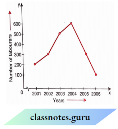
Question 51. In which year was the number of labourers maximum?
- 2001
- 2002
- 2003
- 2004
Solution: 4. 2004
Question 52. In which year was the number of labourers minimum?
- 2003
- 2004
- 2005
- 2006
Solution: 4. 2006
Question 53. What was the difference in the number of labourers in the years 2002 and 203?
- 100
- 200
- 300
- 400
Solution: 2. 200
Question 54. Find the rise in the number of labourers from 2001 to 2004.
- 200
- 300
- 400
- 500
Solution: 3. 400
NCERT Solutions for Class 8 Maths Chapter 13 Introduction to Graphs with Examples
Question 55. Find the sum of the number of labourers in the years 2004 and 2006.
- 700
- 600
- 200
- 500
Solution: 1. 700
Read the circle graph and answer the related questions:
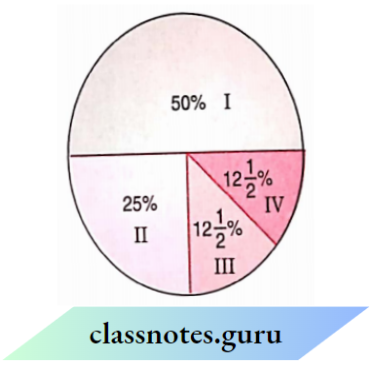
Question 56. There are in all 101000 students a school. The number of students in the class I are
- 500
- 250
- 125
- None of these
Solution: 1. 500
Question 57. The number of students in class II is
- 500
- 250
- 125
- 100
Solution: 2. 250
Question 58. In which two classes is the number of students the sesame
- 1 and 2
- 1 and 3
- 3 and 4
- 1 and 4
Solution: 3. 3 and 4
Question 59. The minimum number of students in any class is
- 125
- 250
- 500
- 1000
Solution: 1. 125
Question 60. The sum of the number of students in class 3 and class 4 is
- 500
- 1000
- 50
- 250
Solution: 4. 250
True-False
Write whether the following statements are ‘D ue or False:
1. The coordinates of the origin are (0, 0): True
2. The .v-coordinate of a point is its distance from r-the axis: False
3. For fixing a point on the graph sheet, we need two coordinates: True
4. The relation between the pendent variable and the dependent variable is shown through a graph: True
Class 8 Chapter 13 Graphs Questions and Answers Step-by-Step
Fill in the Blanks
1. Comparison of parts of a whole can be done by_____: pie chart
2. A point which lies on both these is_____: (0,0)
3. The r-coordinate of every point lying on the y-axis is_____: 0
4. The process of fixing a point with the help of x and y coordinates is called_____of the point: Plotting
5. What will you get after joining the points (-1, -1), (0, 0) and (3, 3): A straight line passing through the origin
6. What will you get after joining the points (1, 0), (1, 1) and (1, -1): A straight line not passing through the origin
7. What is the distance of the point (3, 4) from s-axis: 4
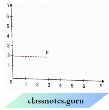
8. In the following graph, what are the coordinates of P: (3,2)
Graph Plotting and Interpretation Class 8 Maths Chapter 13 Solutions
9. In the following graph, which letter indicates (the point (3, 0): A